
NASA Algal Bloom Data Science Challenge
This is a quick look at my approach to the NASA Algal Bloom data science challenge. Here’s my code. Tools used include: Python, Pytorch, Vision Transformer, SWIN Transformer, Numpy, Pandas, CFGrib, XArray, Planetary Computer,…
Introduction
Background
I participated in a data science competiton ending on Febrary 17, and was fortunate to score in the top 3%. This is a post on my approach and challenges I encountered.
First, a little background on the topic is in order. Cyanobacteria are microscopic bacteria found in bodies of water which feed off of sunlight. Although the term algae is mostly reserved for eukaryotes, cyanobacteria are still oftentimes referred to as “algae”. They are omnipresent in most fair climates, but as with most things, the extremes are troublesome for humans. When conditions allow, cyanobacteria will reproduce at incredible rates. Certain kinds of cyanobacteria release harmful toxins as waste byproduct, and when their abundance is extraordinary, the result is a Harmful Algal Bloom (HAB) that poisons the water sources they are present in.
The Goal
The goal of this challenge was to detect and identify the severity of algal blooms in water bodies across the continental United States (CONUS). Specifically, we are given spatiotemporal coordinates (longitude, latitude, date) and asked to predict the density of cyanobacteria present at water bodies present at these coordinates.
The Data
Labels
The labels we were given were:
- Severity level: the classification of algae density level found at the given coordinate
- Density level: The algae density present
Training Data
We were permitted access to the following for training our models:
- Satellite imagery spanning 2013-present, specifically Landsat and Sentinel
- Climate data from the High Resolution Rapid Refresh (HRRR) index
- Digital Elevation Model (DEM) data from Copernicus Satellite
Exploratory Data Analysis
First, I needed an idea of the data I was working with. With a basic EDA I was able to get a sense of the spatial and temporal distribution of data points.
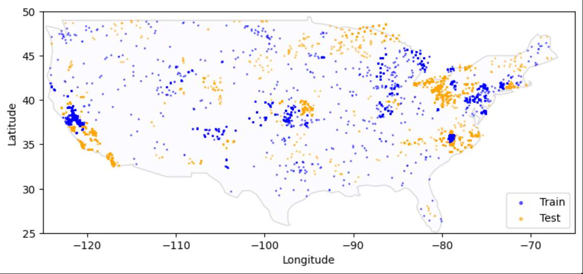
Thoughout the CONUS the data points are distributed in tightly clustered locations. I was unable to grasp the significance of this fact, which was likely my biggest fault.
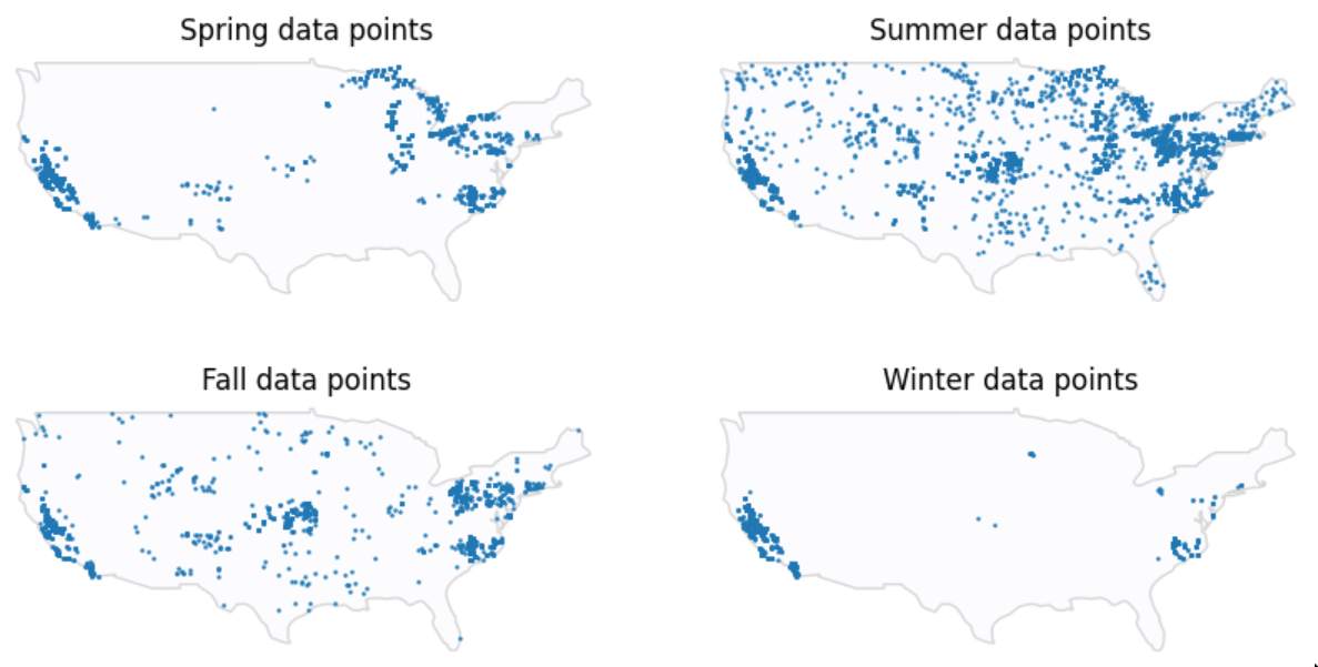
Most data points points are extracted during warmer seasons, which makes perfect sense since warmer climates are more favorable to algae.
/images/severities.jpg)
There are barely any data points at the highest severity level. but a fair amount distributed across the medium levels.
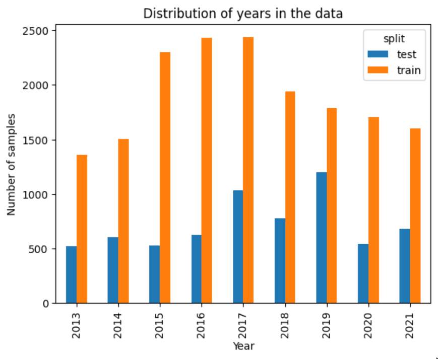
The test data is distributed evenly across years, while training data favors the years 2015-2018.
To get an idea of the look of the satellite and climate data would take much more effort.
My Approach
Organization
First, I recognized that this was a highly complicated set of data that I was unfamilar with, and I needed a way to organize and visualize the tasks, ideas, and research topics I planned to execute on. Initially, I played around with a developer instance of JIRA, but I decided that it was too specialized for working in teams - I was only working by myself, and most features of JIRA would incur unnecessary overhead. I settled on Google Sheets for this, and laid out a basic framework tracking my ideas. At the beginning of the challenge, it looked like this:
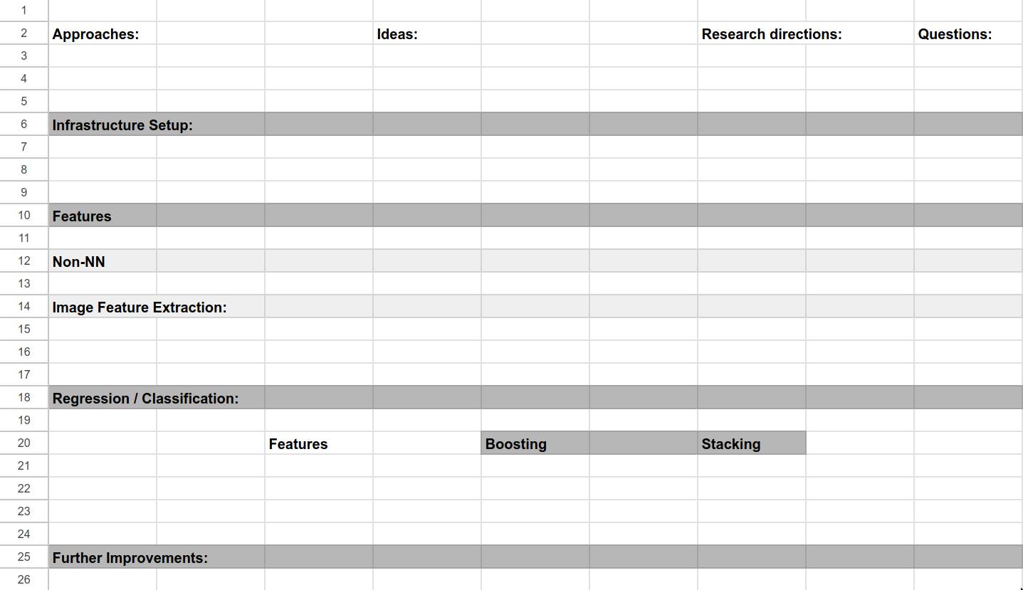
I eventually adopted a coloring scheme to signify progress, used strikethroughs to signify failed ideas, and filled the table out nicely. By the end of the challenge, it looked like this:
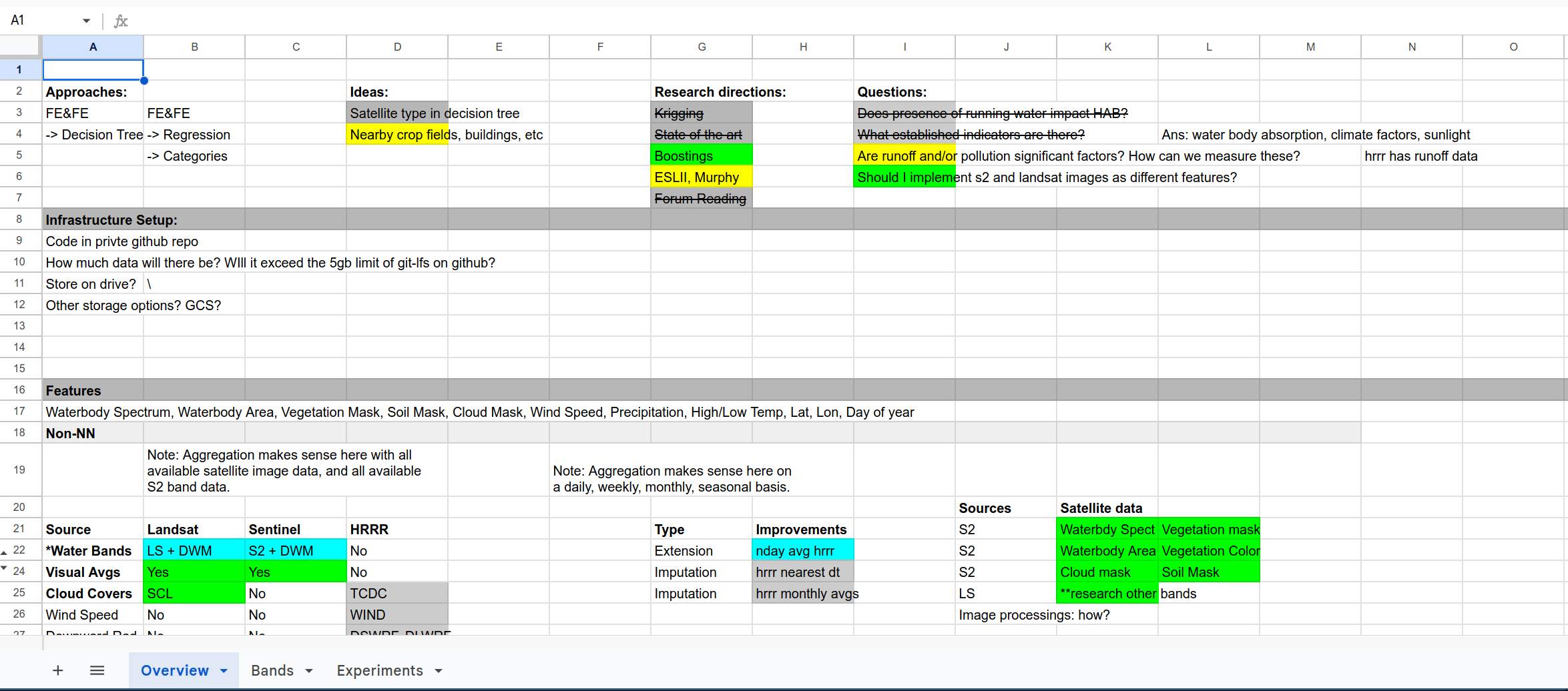
As you can see, every approach, idea, research direction, question, and feature had to be approached systematically. Otherwise, this would have been a true headache to keep track of. Initially I knew very little about cyanobacteria and factors influencing their abundance, and even less about methods of accessing satellite and climate data, so the task at hand seemed daunting.
Initial Thoughts
- The pipeline itself seemed straightfoward enough: feature extraction using a variety of statistics and neural networks, and prediction using an ensemble of boosting and a multilayer perceptron.
- Using the categories to perform training seemed like a waste of information to me. I decided to use the logarithm of algal densities as the prediction value (since they range a few orders of magnitude), and I would convert them to their proper categories post-prediction.
- The main challenge was time. I joined the competition with under 2 weeks to go, so I was going to have to go pretty fast. I had a bit of a naivete about me at the time, and believed that if I went at it with enough determination, it would work out.
- I needed to do research into spatiotemporal data methods. This was a world that I wasn’t familiar with, and I was sure there were suitable methods for use in this task that are household names in that field.
- Similarly, I needed to research the established indicators of HABs.
- Finally, I had in the back of my mind Richard Sutton’s Bitter Lesson to not discount simply throwing data at a neural network
The Plan
After further research and given time considerations, I decided to implement feature extraction for Landsat data and HRRR features first, and if I had time I would incorporate other methods. Feature extraction for landsat would be done with Vision and Swin Transformers, and extraction for HRRR features would be done with averaging. I found a pretrained neural network that did water body segmentation exceptionally well, but there was no license on the model I decided not to go thorugh with it.
Data Challenges
For all data, the following restrictions were in effect:
- During prediction, only data from that date and previous dates could be used. This makes sense as the goal of the project is to detect HABs in real time.
- Satellite and HRRR data are updated at regular intervals, and so some form of averaging needed to be done to get the nearest relevant data point. For each data type, there were also unique challenges associated with them. I’ll briefly discuss each below.
HRRR
The download process was excruciatingly slow, owing to fact that to download the HRRR data for any coordinate, you must download the data for all of the CONUS on that date, and then you must extract that specific coordinate. Here’s a look at the data for temperature:
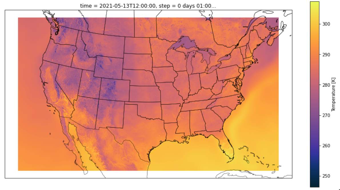
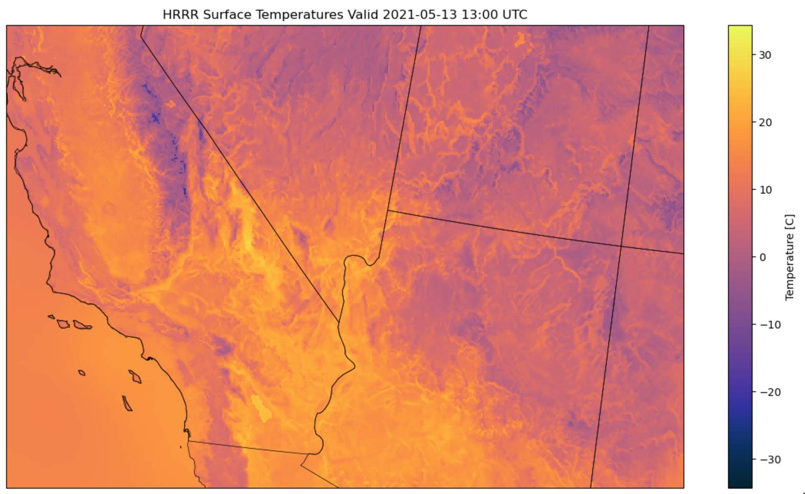
The HRRR Data consisted of measurements distributed across the CONUS in quantities ranging from wind speed and temperature to fancier ones like downward short wave radiation flux. The latter turned out to be instrumental in prediction. However, there were many points which were missing - around 15% of the data did not have a HRRR data label. Specifally, for dates before August of 2014, no HRRR data was available. Additionally, HRRR seemed to sporadically be down on certain dates.
Landsat
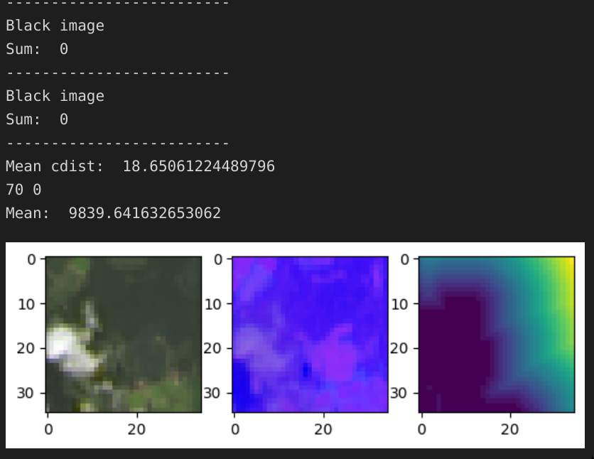
Although there were no missing data points, there were many unusable ones. Satellite presents the unique challenge that during nighttime and at times of high cloud cover, the image consists of pure black or blurry white, respectively. Here are some examples:
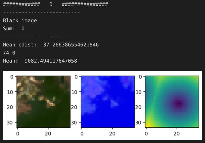
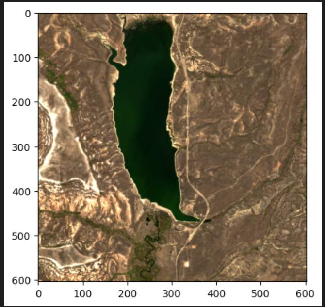
However, when it’s a good day, the image can be quite beautiful when viewed from a larger distance:
I created a simple cloud / black image detection pipeline for filtering out bad data, and fine-tuned a ViT and SWIN Transformer on the resulting images.
Results
The HRRR data improved my score substantially from 1.2 RMSE using averaged image pixels to 0.95 RMSE, with Downward Short Wave Radiation being the most significant predictor (using the Shapley Values).
The neural networks were trained using all the usual techniques: augumentations, warmup, learning schedule, layernorm, dropout, and attention layer dropouts, with the log density as the prediction values. However, non of these ended up preventing the neural networks from overfitting, and although there was some really interesting behaviour that ocurred during training, none of it ultimately amounted to much.
Retrospective
In hindsight, I did not focus enough on developing a robust cross-validation technique. This cost me dearly, and despite many hours poured into fine-tuning and gathering data for the neural netowrk, they did not yield substantial improvements over the HRRR data. Indeed, since the data points were clustered so tightly, some locations were sampled multiple times, and this caused significant overfitting to the training data.